EDA 2D Charts#
The EDA 2D Charts panel enables you to explore relationships between two features in your dataset through customizable 2D visualizations.
Initialize the Panel#
To create and initialize the EDA 2D Charts panel, use:
# Load the Experiment and view the 2D chart
from modeva import Experiment
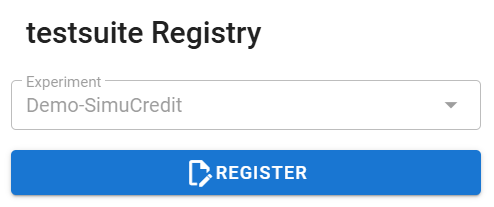
exp = Experiment(name='Demo-SimuCredit')
exp.eda_2d()
Workflow#
Step 1: Load and Select Dataset#
Choose a dataset from the dropdown (e.g.,
Demo-SimuCredit).Select a data split (e.g.,
main,train,test).
Step 2: Configure Visualization Settings#
Choose a feature for the X-axis (e.g.,
Mortgage) and a feature for the Y-axis (e.g.,Balance).
- The following chart types are available based on feature types:
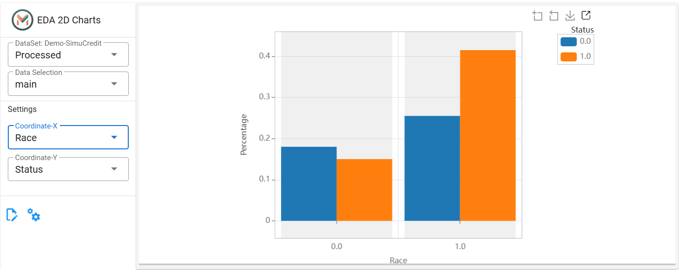
Bar chart (Categorical vs. Categorical): If both features are categorical, a bar chart is generated. The bar chart displays the frequency distribution of categories.
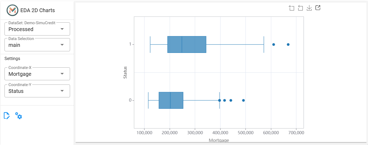
Box plot (Numerical vs. Categorical): If one feature is numerical and the other is categorical, a box plot is generated. The box plot summarizes the distribution of numerical values by category.
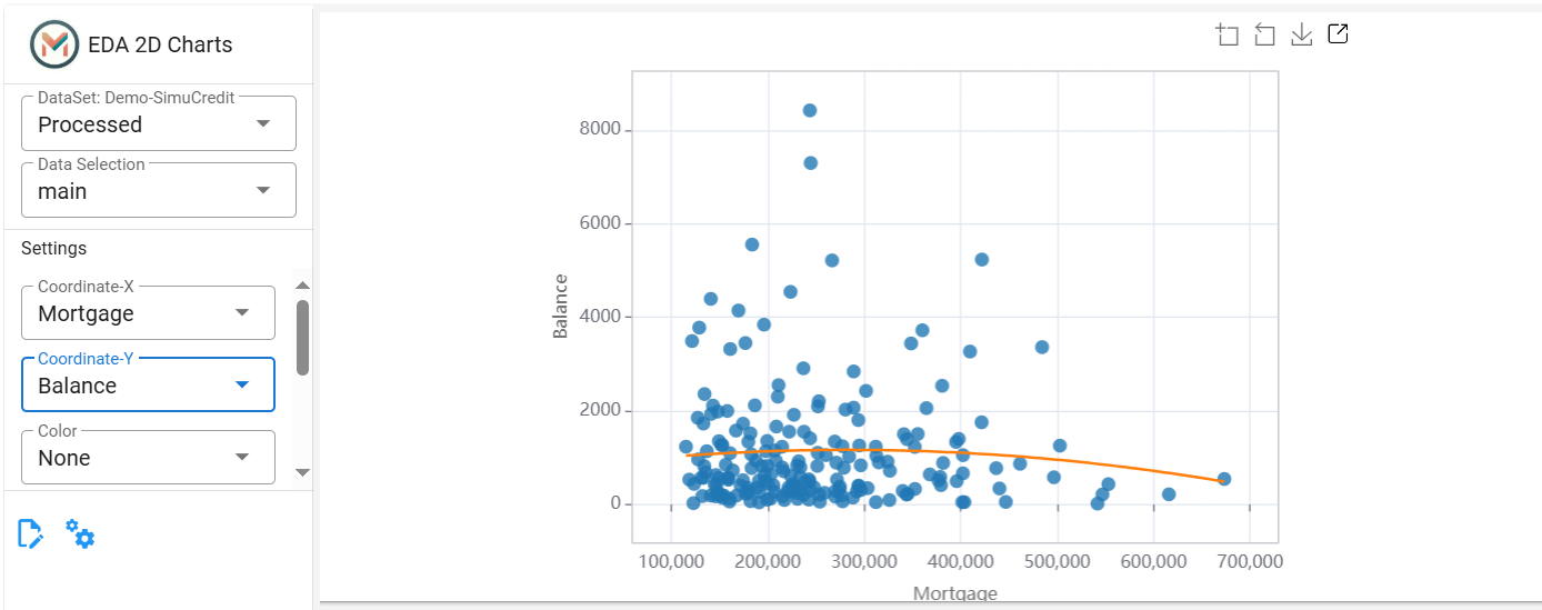
Scatter plot (Numerical vs. Numerical): If both features are numerical, a scatter plot is generated. The scatter plot displays individual data points and trend lines to visualize correlations.
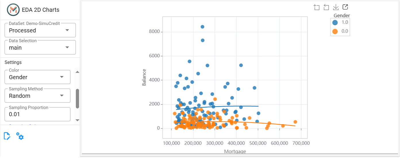
(Optional, Numerical vs. Numerical Only) Add a third feature to color-code data points (e.g.,
Status). Colors are applied based on numerical gradients or categorical labels.(Optional, Numerical vs. Numerical Only) Reduce data density using Random sampling (default). Adjust the Sampling Proportion (e.g., 0.05 for 5% of data).
(Optional, Numerical vs. Numerical Only) Apply a polynomial trend line (Order 1-3) to visualize patterns.
Interactive Features
Hover over points to see values.
Resize the plot by scroll up and down.
Click the
 button to view the plot in full screen.
Click the
 button to download plots as images for sharing or documentation.
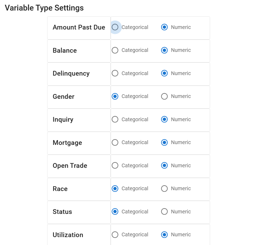
Step 3: Adjust Feature Types (If Necessary)#
Click the ![]() to reclassify features as numerical or categorical using the radio buttons.
to reclassify features as numerical or categorical using the radio buttons.
Step 4: Register and Save the Visualization:#
Click the
 to save plots for future reference.
This panel is ideal for uncovering relationships, outliers, and trends in your data. For more detailed analysis, explore different sampling methods or combine with 1D summaries from the Data Summary Panel. For more information, refer to the Exploratory Data Analysis.